
Clincard E-commerce Selling in 20 Days What Used to Take Months
Clincard had traffic and no sales. Marketing delivered leads and clicks, the closing never happened, and the support team could not use the site as a source of information for customers. I rebuilt the navigation, the checkout, and the technical architecture of the store, aiming at two audiences at once: people arriving to buy and people who were already members.
The problem
The company had growth targets that were missed meeting after meeting. Marketing delivered leads and clicks, the closing never happened. On the other side, the support team could not use the page as a customer information guide, so customers called to ask what the site should have answered and the demand for human support kept growing out of proportion.
I ran a research phase with the company administrator, the managers, and the call center operators to hear the pain from every end. The diagnosis pointed to four problems on the same page:
- Responsiveness errors, which pushed away the 35 to 55 audience, exactly the group that depends most on accessibility and ease of use.
- A dated visual language that did not speak to the brand and broke the expectation of anyone entering through the top of the funnel on Instagram.
- A checkout too dense with information, which killed credibility at the moment of purchase.
- Static systems that depended on manual updates and served outdated information, generating even more support calls.

The decision
Coming out of the research, I wrote the documentation for what the ideal site would be, with the conversion metric on one side and accessibility for existing members on the other. The navigable prototype, built on the sitemap and on the journeys of each user type, was the key piece to validate all of it before any final screen.
The work was split into sprints. The page redesign had to speak in a timeless way to the branding already running at the top of the funnel, which cost the interface some of its personality. That is a deliberate trade-off: branding will fluctuate and change over time, and the interface design has to keep working across whatever phase comes next within the brand guidelines.
The main focus was the checkout and the CTAs leading into it. The previous navigation had no pages explaining the product benefits clearly, and each page spoke to a different audience because the site had grown improvised. Reorganizing the navigation gave flow to the checkout, which is where business rules show up most seriously. Payment flow is designed slowly and strategically, so I sat down with executives, the technology team, and area managers to define what was strictly necessary in the form.
Beyond cutting fields, I used UX writing to reduce the "but why do they need this information?" question. The gain was less about volume, the first step went from 15 to 13 fields, and more about arrangement: what used to be one long card became steps with named groups, six fields in the opening one. The block previously called just "Cadastro", registration, became "Dados do titular", the cardholder details. The word cardholder points to something almost legal, a role, a position, and that makes it obvious those fields exist for legal registration.

The project was also a complete architecture change on the technology side. That fixed responsiveness at the root and opened space for reworked features using real data APIs, which started updating on their own what previously depended on someone remembering to update it.
The outcome
A health benefits card product started selling in 20 days what it did not sell in 3 or 4 months. Every interaction and time on page metric went up more than 2.25x.
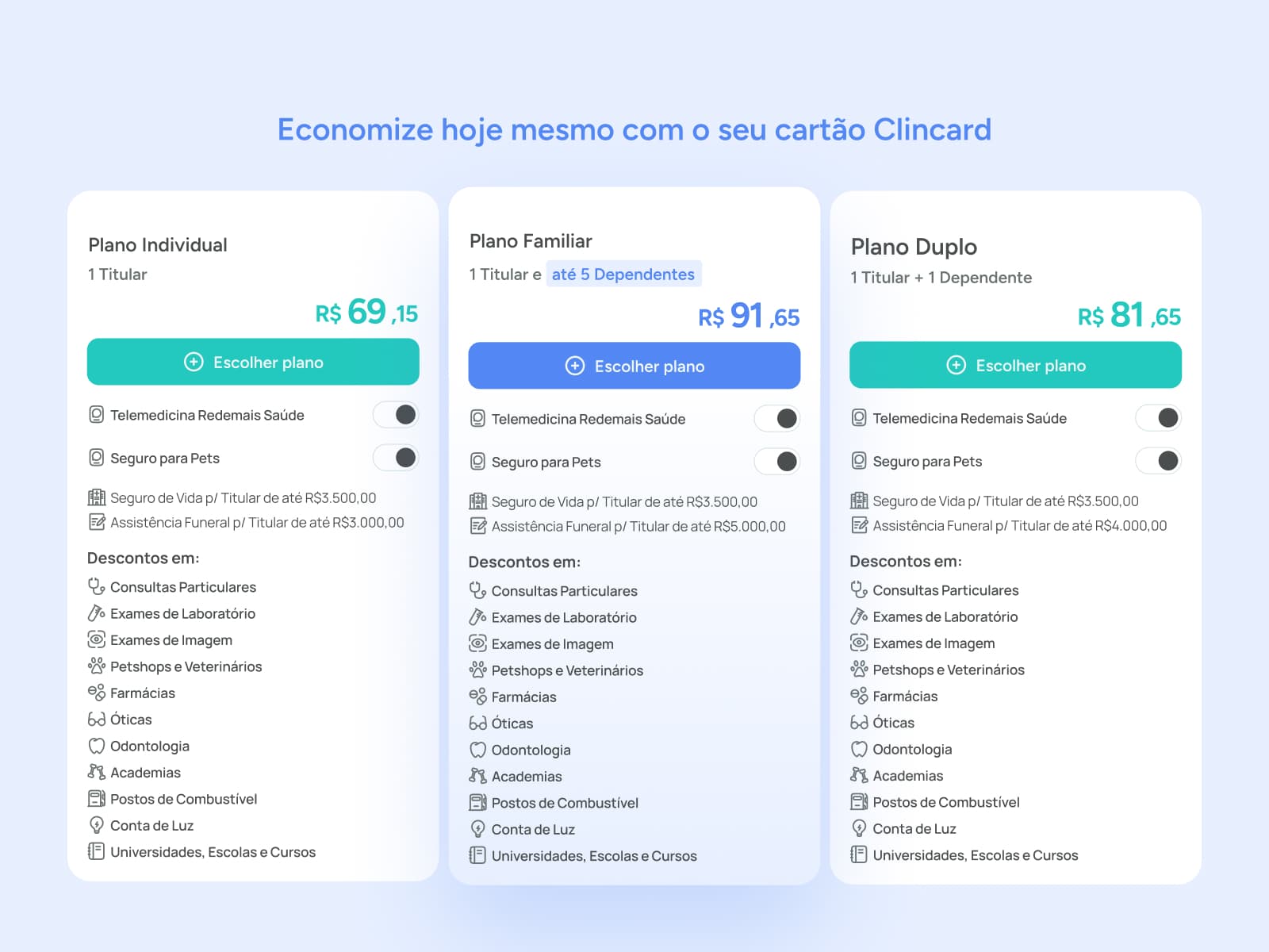
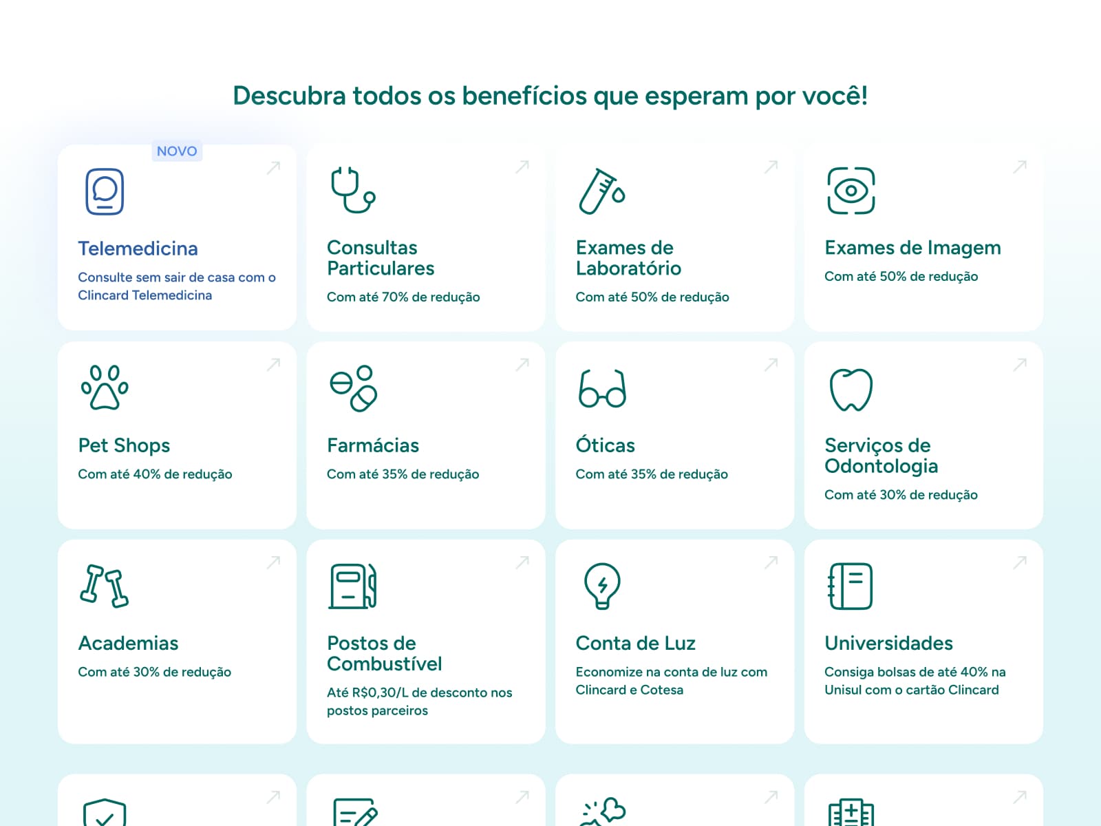
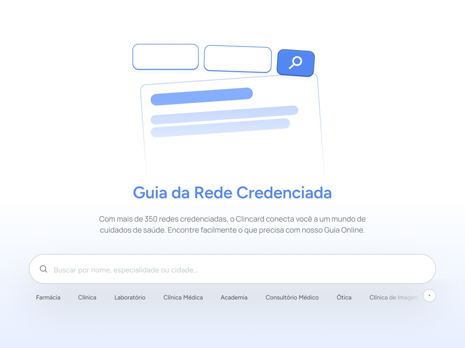
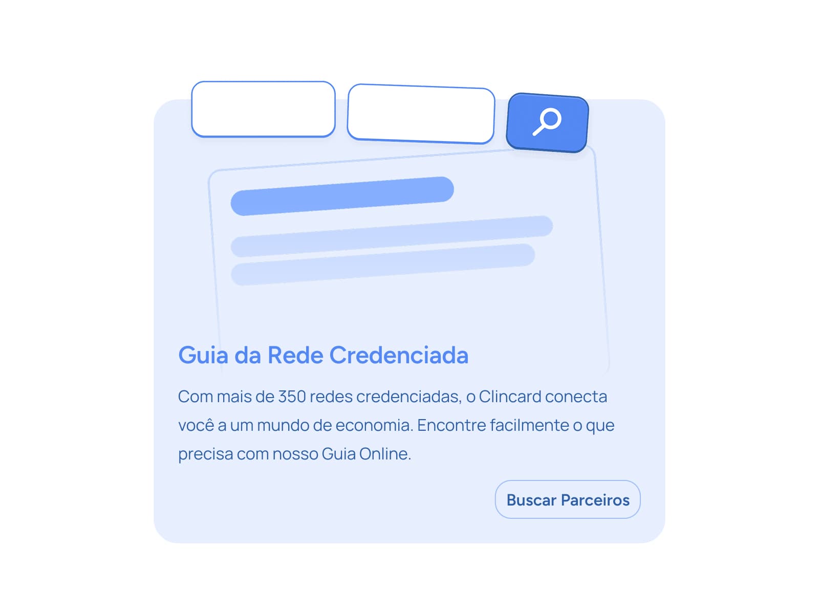
New users were not the only ones who arrived. Existing members also started finding information with more clarity, which solved the secondary pain of the project: the excess of manual work in customer support.
Past prototyping and journey strategy, this project taught me how companies respond to the processes they created themselves. That is why ignoring one of the audiences to focus only on sales or only on existing members was never an option. Even so, a new digital product suggestion was approved along the way, and that is where the Clincard app came from.
Full redesign of the e-commerce for a health benefits card. Research with the company administrator, managers, and call center operators before any screen. Navigable prototype built on the sitemap and on journeys per user type. Checkout reorganized into steps with named groups, six fields in the opening one, and UX writing that explains why each piece of data is asked for. Complete change of technical architecture, fixing responsiveness and moving information updates to real APIs. The product sold in 20 days what used to take 3 to 4 months, with interaction and time on page up 2.25x.